PYTHON
Welcome to sulfur dioxide air pollution!
Cumbrevieja is a volcano located in la Palma island. It's an active volcano producing sulfur dioxide gases in the atmosphere.
The weekend 25 to 26 of September 2021 air pollution from the volcano arrived to Catalonia as you can see in the following graph.
The graph was created using matplotlib library in python and the code is below.
Data are obtained from the air pollution website of Generalitat de Catalunya.
  import matplotlib.pyplot as plt  # It makes accesible all the instuctions and codes contained in matplotlib in order to create graphs

x = [1,2,3,4,5,6,7,8,9,10,11,12,13,14,15,16,17,18,19,20,21,22,23,24,25,26,27,28,29,30,31,32,33,34,35,36,37,38,39,40,41,42,43,44,45,46,47,48]
  # x data is 48 hours data obtained from Generalitat data base corresponding to SO2 in the weekend of interest
y = [ [1,1,1,1,1,1,1,1,1,1,1,1,1,1,1,1,1,1,1,1,1,1,1,1,1,1,1,1,1,1,1,1,1,1,1,2,2,2,2,2,1,1,1,1,2,1,1,1],
      [1,1,1,1,1,1,1,1,1,1,1,1,1,5,1,1,1,1,1,1,1,1,1,1,2,5,5,1,3,3,3,2,3,2,1,1,1,1,1,1,1,1,1,1,1,1,1,1],
      [2,2,2,2,2,2,2,2,2,2,2,2,2,2,1,1,1,1,1,1,1,1,1,1,1,1,1,1,1,1,1,1,1,1,1,2,2,1,1,1,1,1,1,1,1,1,1,1] ]
      # y data are SO2 levels hour by hour in the 3 cities indicated in labels

labels=['Terrassa', 'Montseny', 'Santa Perpètua de Mogoda']
colors=['bisque','lightpink','lightcyan']
  # colors of the 3 cities are bisque, lightpink and lightcyan

# loop over data, labels and colors
for i in range(len(y)):
    plt.plot(x,y[i],'o-',color=colors[i],label=labels[i])
plt.title("AIR SULFUR DIOXIDE IN CATALONIA", loc='left')
plt.xlabel("Hours of weekend 25-26/09/2021")
plt.ylabel("SO2 microgram/m3")
plt.legend()
plt.show()
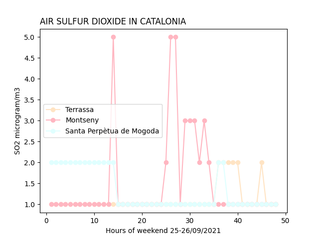
In conclusion, in this graph of air pollution we can see how the gases produced by the volcano of La Palma have only reached Montseny. In Terrassa i Santa Perpètua de Mogoda there is very little pollution and depending on the hours we can see that it is the usual air pollution.